Some time ago I found a collection of CPS2 labels for download. I ordered some sticky backed gloss paper and printed a few off to see what I could do as most of the labels on my games are in a poor state.
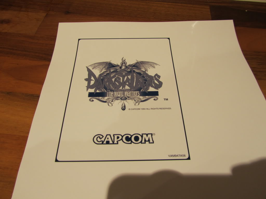
The non colour labels on the CPS2 games are usually blue on a white background where as the labels I downloaded were black/grey on a white background. In order to make these look a bit more authentic I ran them through Photoshop and changed the colour for something more suited.
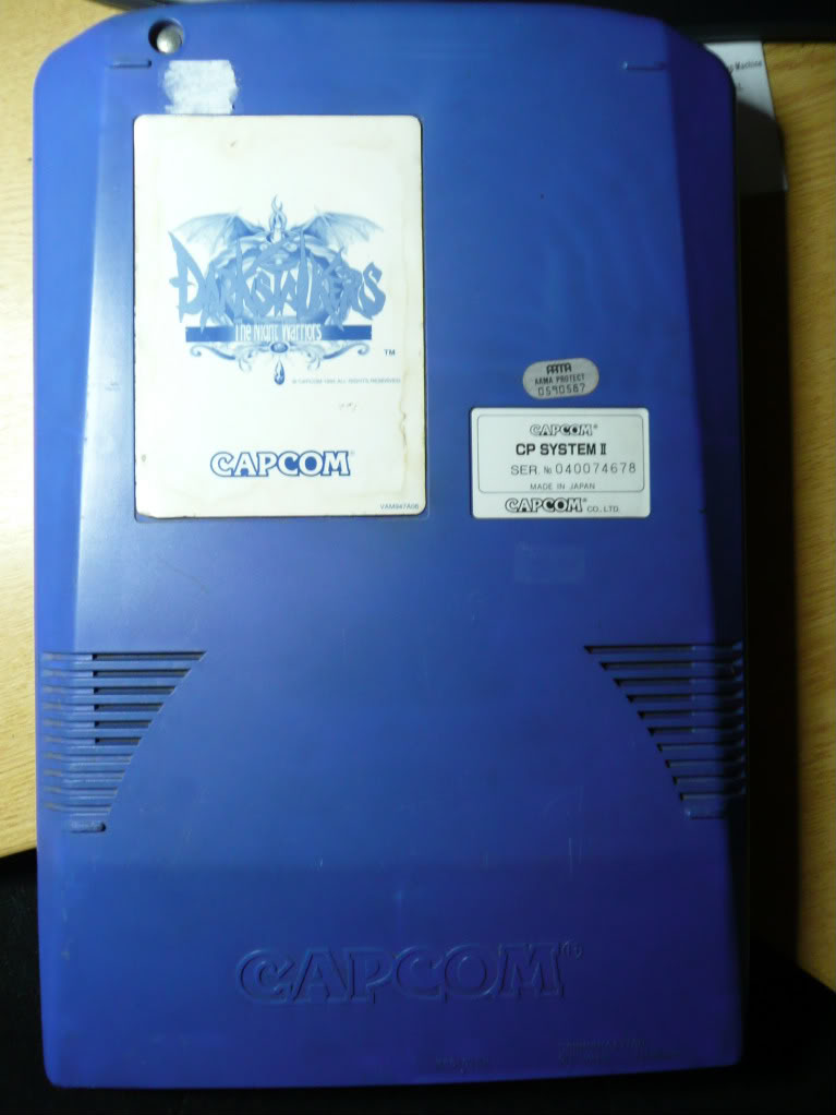
I printed a couple of test subjects out on normal paper just to make certain the sizes were all correct which they were and set off my first print on the gloss paper. The result was very impressive but I had the blue too dark compared to the original. The first picture is the original on the game board, the second is the print out. I struggled with lighting on all these pictures so they arent too good.
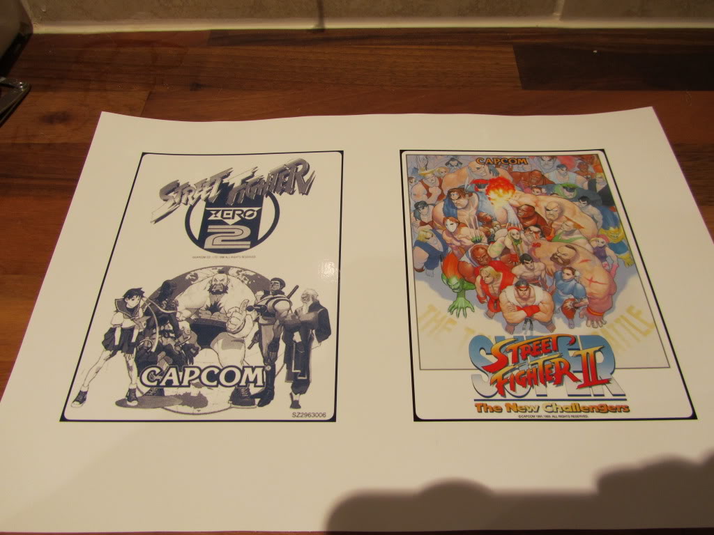
The colour labels I have also came out very good.
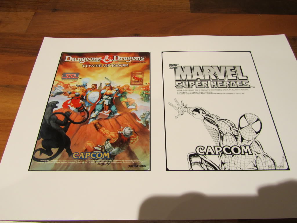
The Dungeons & Dragons label was not in the collection of labels I had downloaded so I carefully removed the label that was on mine (it was hanging off anyway) and scanned it in at a high DPI. As the colours were a little washed out on the original I adjusted them a little in Photoshop. The results were much better than I could have hoped for.
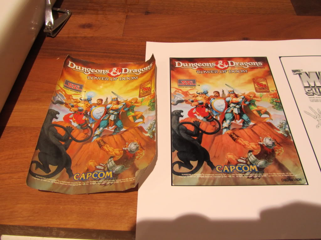
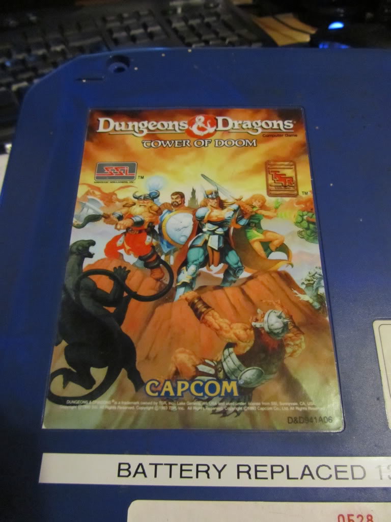
Overall im very happy with the outcome of these labels.
If you need replacement labels contact Spectre over on the Arcade Otaku forums. The quality is superb.

Sorry, the comment form is closed at this time.